pheatmap(matrix,display_numbers=T,color=colorRampPalette(rev(c("red","white","blue")))(102)) #自定义颜色,使用红白蓝色系
pheatmap(matrix,display_numbers=T,fontsize=15) #fontsize设置热图中整体的字体为15
(1)生成测试数据集
#测试数据的生成参考了参考资料的第三个
test = matrix(rnorm(200), 20, 10)
test[1:10, seq(1, 10, 2)] = test[1:10, seq(1, 10, 2)] + 3
test[11:20, seq(2, 10, 2)] = test[11:20, seq(2, 10, 2)] + 2
test[15:20, seq(2, 10, 2)] = test[15:20, seq(2, 10, 2)] + 4
colnames(test) = paste("Test", 1:10, sep = "")
rownames(test) = paste("Gene", 1:20, sep = "")
(2)直接生成热图
pheatmap(test)
pheatmap(test,treeheight_row=100,treeheight_col=20) #设置col、row方向的树高
#取消列聚类,并且更改颜色
pheatmap(test,treeheight_row=100,treeheight_col=20,cluster_cols=FALSE,color=colorRampPalette(c("green","black","red"))(1000))
#取消单元格间的边框,调整字体大小,并且保存在桌面文件中
pheatmap(test,treeheight_row=100,treeheight_col=20,cluster_cols=FALSE,color=colorRampPalette(c("green","black","red"))(1000),border_color=NA,fontsize=10,fontsize_row=8,fontsize_col=16,file='C:/Users/xu/Desktop/test.jpg')
#增加分组信息,使得pheatmap显示行或列的分组信息
#这部分以及之后的内容参考了第四篇参考文献
annotation_col = data.frame(CellType = factor(rep(c("X1", "X2"), 5)), Time = 1:5) #增加Time,CellType分组信息
rownames(annotation_col) = paste("Test", 1:10, sep = "")
annotation_row = data.frame(GeneClass = factor(rep(c("P1", "P2", "P3"), c(10, 7, 3)))) #增加GeneClass分组信息
rownames(annotation_row) = paste("Gene", 1:20, sep = "")
pheatmap(test, annotation_col = annotation_col, annotation_row = annotation_row)
#使用annotation_colors参数设定各个分组的颜色
ann_colors = list(Time = c("white", "green"),cellType = c(X1= "#1B9E77", X2 = "#D95F02"),GeneClass = c(P1 = "#7570B3", P2 = "#E7298A", P3 = "#66A61E"))
pheatmap(test, annotation_col = annotation_col, annotation_row = annotation_row, annotation_colors = ann_colors)
# cutree_rows, cutree_cols可以根据行列的聚类数将热图分隔开;
pheatmap(test,cutree_rows=3,cutree_cols=2)
result <- pheatmap(test)
summary(result)
# 行的聚类排列顺序
result$tree_row$order
# 得到行名的顺序
rownames(test)[result$tree_row$order]
# 查看按行聚类后的热图顺序结果
head(test[result$tree_row$order,])
# 查看按照行和列聚类之后,得到的热图顺序结果
head(test[result$tree_row$order,result$tree_col$order])
pheatmap总体来说使用起来比较简单,可以同时绘制热图和系统树图,参数的设置也很简单。此外,pheatmap包默认计算两两样本间的欧氏距离,然后利用欧式距离实现样本的聚类。
本来打算一起写在这篇这里的,但是写到这里内容已经很多了,所以这部分的内容会在下一篇出现。
下一篇链接更新:R语言绘制热图(其实是相关系数图)实践(二)corrplot包
干货 | heatmap常用参数应用及案例演示
5个画热图的R包,你都知道吗?
R语言绘制热图——pheatmap
R语言绘制热图——pheatmap_可视化分析
用R包中heatmap画热图
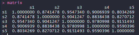
R语言绘制热图实践 (一)pheatmap前言pheatmap包pheatmap简介常用参数介绍使用安装绘制样本间相关系数图(简单使用)差异表达基因热图(进阶使用)pheatmap总结corrplot包参考资料前言在生信分析中,我们常常需要计算一个样本的几次实验结果或者不同样本实验结果的相关系数(样本间相关系数)以判断几个数据集之间相关的程度。在本篇中及之后的内容中,为了用R得到相关系数热图...
# Create test matrix
test = matrix(rnorm(200), 20, 10)
test[1:10, seq(1, 10, 2)] = test[1:10, seq(1, 10, 2)] + 3
test[11:20, seq(2, 10, 2)] = test[11:20, seq(2, 10, 2)] + 2
test[15:20, seq(2, 10, 2)] = test[15:20, seq(2, 10, 2)] + 4
colnames(tes
一般来说,R中使用pheatmap绘制聚类热力图的写法如下:
pheatmap(sample_1,scale = "row",fontsize=6, fontsize_col = 8,cluster_cols = F,
color = colorRampPalette(c("steelblue", "white", "firebrick3"))(10),
这里的第一参数为数据,第二个参数 scale="row" 表示对于行数据进行 归一化 , cluster_cols 表示是否对列
pheatmap: Pretty Heatmaps——Implementation of heatmaps that offers more control over dimensions and appearance.
library(pheatmap)
#创建数据集test测试矩阵
test = matrix(rnorm(200), 20, 10)
test[1:10, seq(1, 10,
A function to draw clustered heatmaps where one has better control over some graphical parameters such as cell size, etc.
pheatmap 这个包可以认为是heatmap的加强版,基本可以一包走天下了。
一、参数解析
Usage
pheatmap(mat, c.
目录前言corrplot包简介语法和常用参数介绍函数语法参数介绍实践summary参考资料
在我的上一篇的内容中(R语言绘制热图实践(一)pheatmap包 ),我以绘制相关系数图为出发点,介绍了使用pheatmap包画相关系数图和热图的一些使用。
为了对比,这篇将介绍使用R包corrplot进行相关系数图的一些实践以及corrplot包的一些使用。
corrplot包简介
The...
1.什么是热图?
在组学研究的相关文章中,我们常常可以看到热图(Heatmap)的展示。这些红绿相间且色彩变化丰富的热图总是能吸引读者的眼球,从而为文章增添不少亮色。当然,作为严谨的科学研究论文,图表的展示当然不可能仅仅是为了好看。热图作为一种对实验数据及其分析结果的直观的表达方式,在很多文章中都有着不可或缺的地位。
它是一种将规则化矩阵数据转换成颜色色调的常用的可视化方法,其中每个单元格对应数据的某些属性,属性的值通过颜色映射转换为不同色调并按规则填充单元格。
本文我们就来讨论一下热图是如何绘制的以
这是一个示例代码,用于绘制R语言物种丰度热图:# 读取数据
data <- read.csv("species_abundance.csv")# 绘图
p <- ggplot(data, aes(x = species, y = abundance)) +
geom_col(fill = "blue") +
scale_y_continuous(breaks = c(0, 10, 20, 30, 40, 50, 60, 70, 80, 90, 100)) +
labs(title = "物种丰度热图", x = "物种", y = "丰度")# 显示绘制的图
print(p)